Scimar
A biotech company changing how the world prevents, detects, and treats type 2 diabetes
Creating separate but integrated brand identities for this biotech company’s investment and clinical trial arms allowed audiences to understand the two entities as related but distinct. Scimar emerged from a Canadian medical researcher’s ground-breaking discovery that a previously unidentified hormone called hepatalin plays a role in type 2 diabetes and its management.
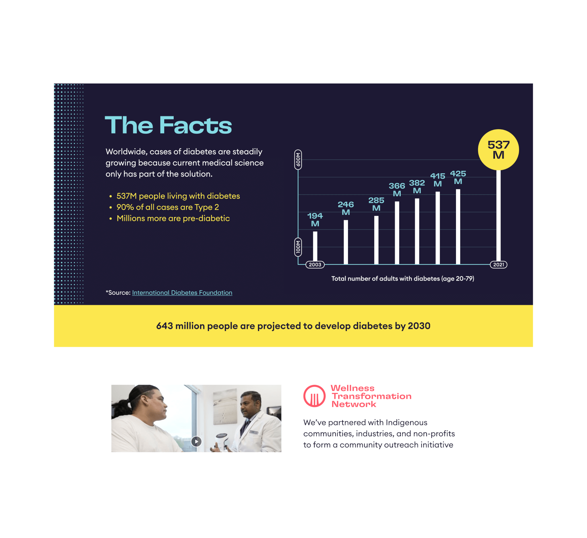
The company is forging a path to further its research and product development based on this discovery through its Wellness Transformation Network (WTN). With 573M people living with diabetes worldwide (90% type 2), Scimar’s innovation has the potential for an incredible global impact.

The Ask
As Scimar prepared to move to the next stages of product development and clinical trials, it wanted to connect and engage with new audiences and investors through its brand design and website. The company envisioned growing opportunities to develop new entities and products and needed a flexible brand identity design that could adapt.
Scimar wanted its website to remain on the WordPress platform and needed strategic direction on its content and brand integration. Designing the site to be accessible to the largest audience possible was also a priority.

The Solution
Through a collaborative discovery process that informed our strategic direction, we crafted a brand identity system that addressed Scimar’s distinct audiences while presenting as a cohesive whole. Comprehensive brand standards guidelines will help the company navigate the new brand’s current and future applications.
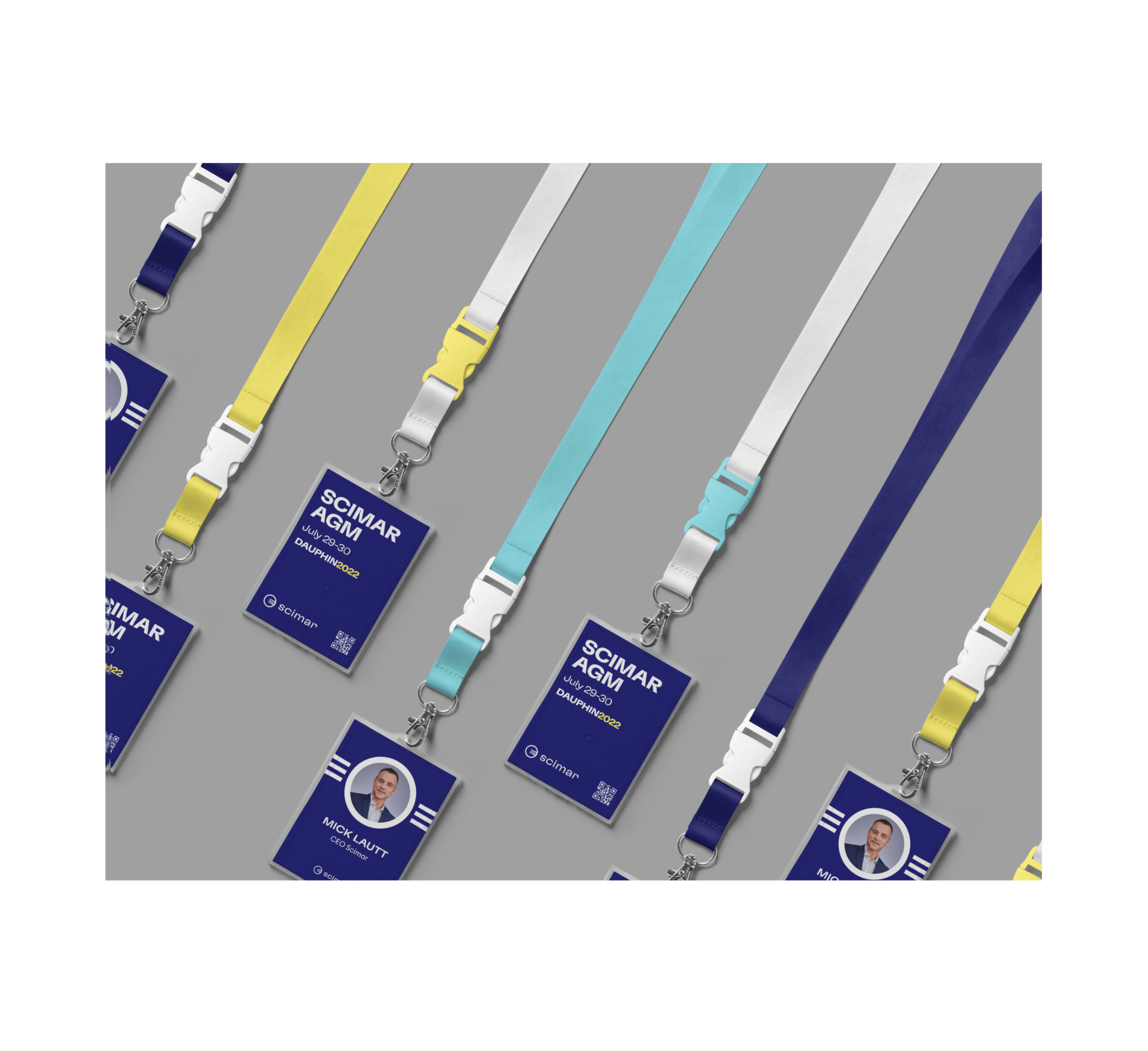
The Scimar identity balances the fact that its work and mission are rooted in science while appealing to investors who want to be part of something transformative. We designed a striking visual mark that reflects the three unique biological signals needed to release hepatalin. The round shape implies Scimar’s global impact, and the negative space is inspired by the shape of a hand, demonstrating the company’s people-first approach.
The Wellness Transformation Network’s identity echoes the grassroots, community-based approach to solving the diabetes crisis. A literal twist on the Scimar mark represents the change-making approach to rethinking type 2 diabetes. In this iteration, the shape represents wholeness, connection and a safe space. The vertical lines embody a kind of waterfall and the cascading impact of WTN’s community-based partnerships.
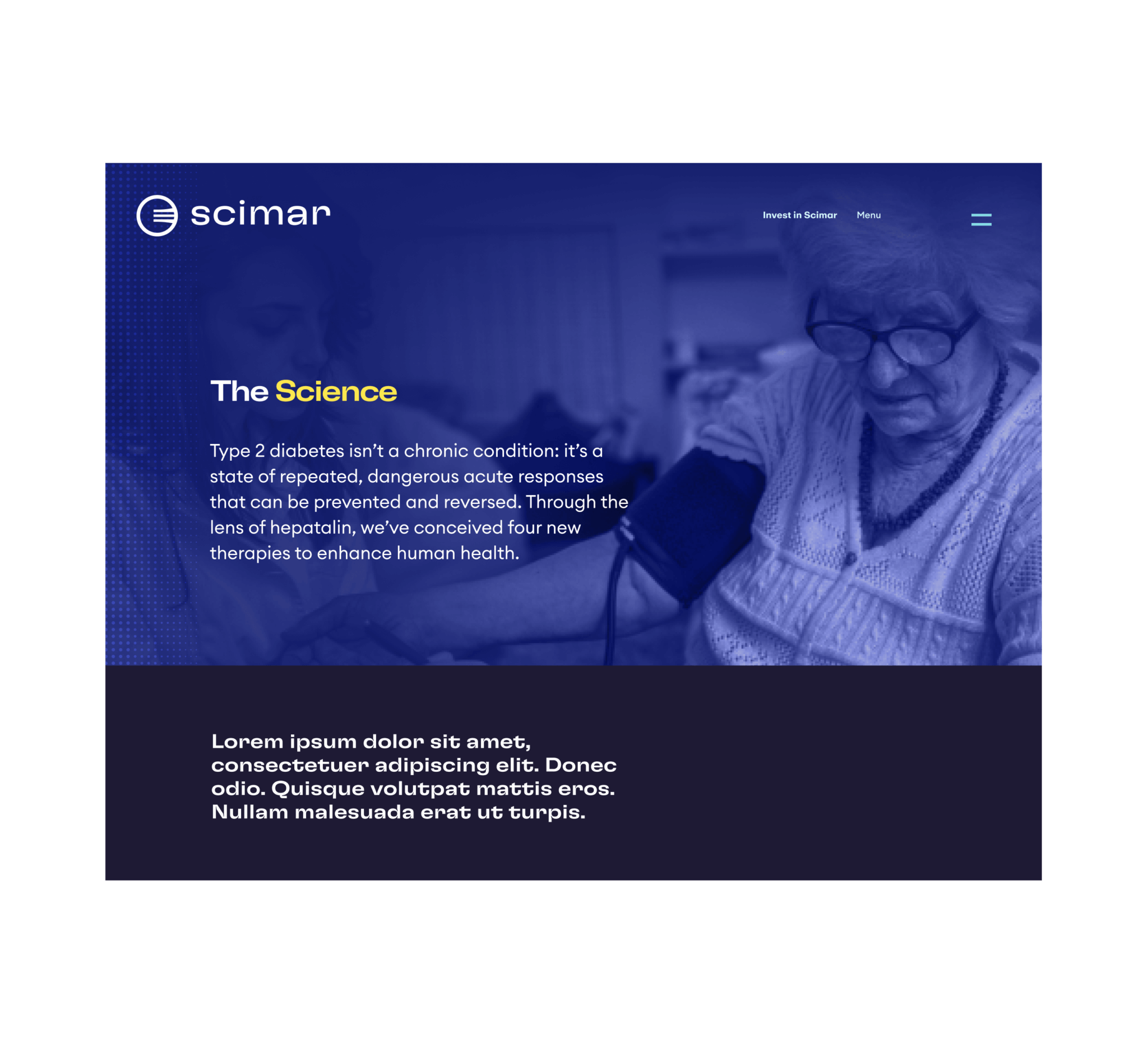
With brand identities in place, we turned to designing and developing an engaging WordPress site, which launched in a speedy six weeks. Paying attention to how visitors would flow through the site, we used motion and graphics that communicate Scimar’s messaging in a scientifically credible yet approachable way. The site’s development complies with Level A Web Content Accessibility Guidelines supported by back-end customizations that allowed the design vision to come to life.


Highlights
Eye-catching motion graphics can present challenges for those with neurological conditions, but our development team was able to adhere to accessibility standards by incorporating a play/pause button on our homepage video feature. We also built customized logic and other backend components to accommodate our design vision.

Our Role:
- Custom Wordpress Development
- Graphic Design
- Identity / Branding
- Strategic Direction
More Projects

Thinking about a project?
Start a project. Ask for advice. Say hello.
Mangrove respects the GDPR and will never share your information without consent. Read our privacy policy for more on how we handle your personal information.