
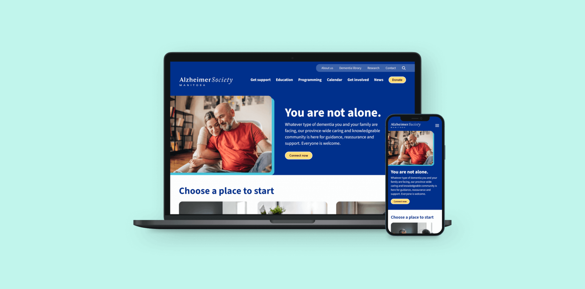
The Ask
The Alzheimer Society of Manitoba came to Mangrove for a full website redesign and development ask to modernize their digital presence and better serve their community, as their existing site longer met the needs of their team or audience. A custom WordPress website and clear content strategy would make it easier for visitors to find information, explore services and events, and support the organization’s mission. The new site needed to offer a welcoming, intuitive experience, helping users take meaningful action and connect confidently with the Alzheimer Society’s programs, resources, and stories.
The Solution
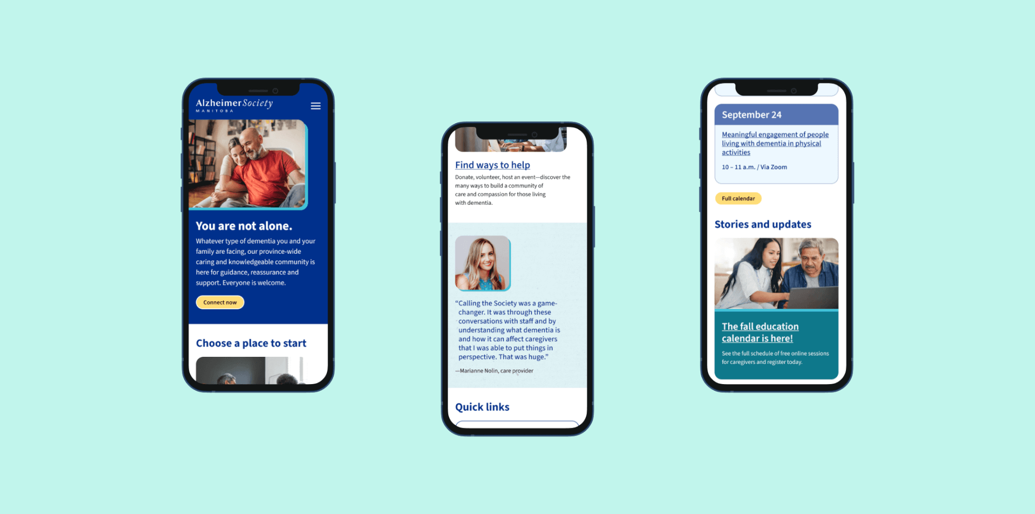
We redesigned the Alzheimer Society’s website to reflect the organization’s compassionate mission and help visitors more easily find the support they need. Built on WordPress, the new site gives the team greater flexibility to manage content and update information.
Working alongside content strategist Deborah Zanke, who provided messaging, copywriting, and insight on site architecture, we refined the site’s structure and messaging to help guide visitors with clarity. A reorganized Resource Library and flexible events calendar make it simpler for users to find the information and opportunities most relevant to them.
Accessibility was woven into every stage of design and development, ensuring the site meets WCAG Level AA standards and provides an inclusive experience for as many visitors as possible.
The refreshed design brings warmth and reassurance through a thoughtfully chosen color palette, subtle logo refinements for improved readability, and photography representing people with diverse lived experiences.
The result is a modern, approachable website that helps visitors find answers, feel supported, and take the next step—whether that means learning about dementia, connecting with a program, or contributing to the Alzheimer Society’s work.


Highlights
- The calendar allows for easy management of programs and events with flexible scheduling options, eliminating the need to create duplicate posts.
- The color palette builds on the Alzheimer Society’s brand and focuses on cool tones like blue, known to be calming, while using warmer colors sparingly.
- The logo was adjusted slightly for improved accessibility, shown in a single color for better contrast and updated to enlarge and left-align “Manitoba” for greater readability.
- Bright, colorful images feature individuals and families from diverse lived experiences, represented in realistic and supportive scenarios.
Roots:
- WordPress
Our Role:
- Custom Wordpress Development
- Content Strategy
More Projects

Thinking about a project?
Start a project. Ask for advice. Say hello.
Mangrove respects the GDPR and will never share your information without consent. Read our privacy policy for more on how we handle your personal information.