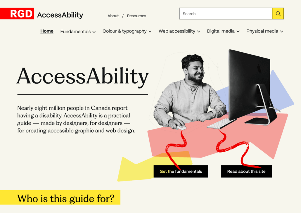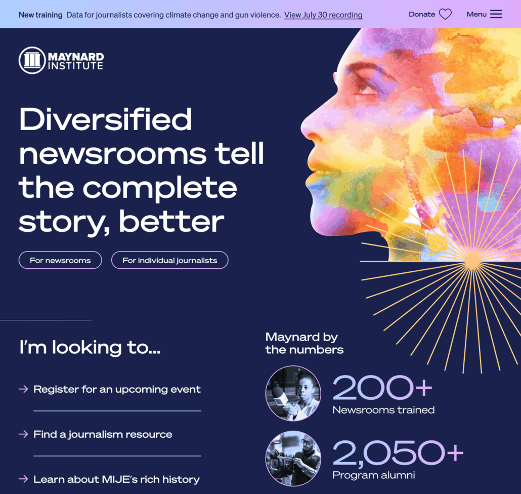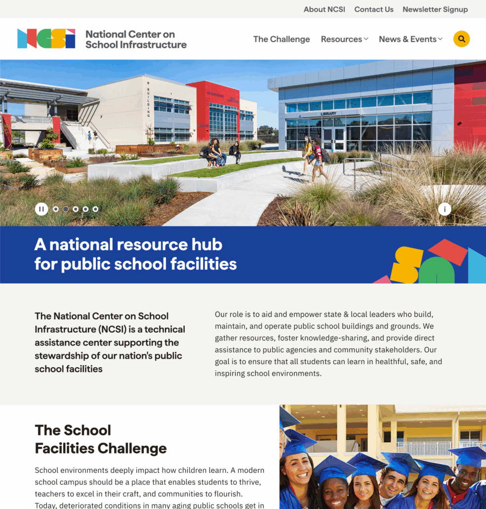
Thank you deeply for this work. We love this site. We are excited to share it with the world. You made it stunning and engaging and original. THANK YOU.
The Plan
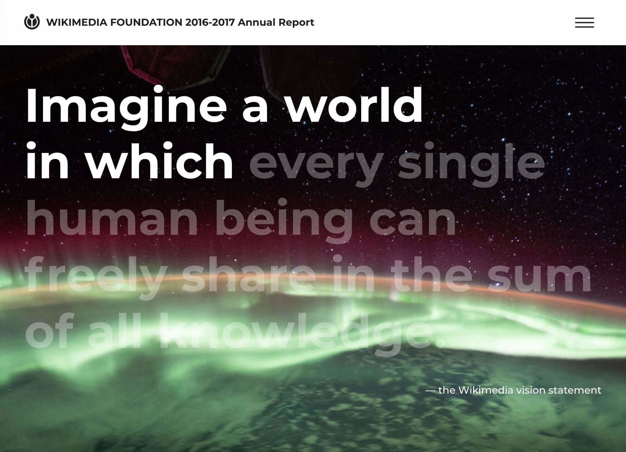
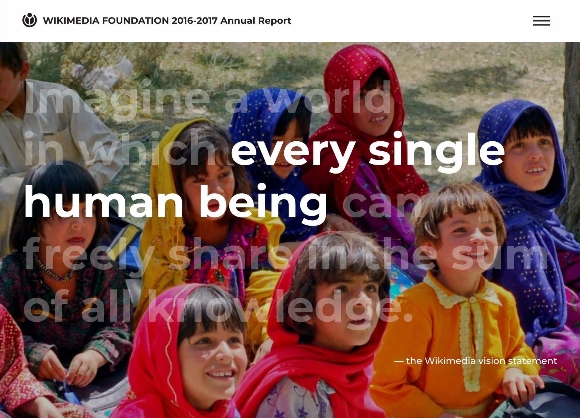
In prior site analytics, it was apparent that most of the Wikimedia Foundation Annual Report visitors landed on the homepage and stayed there, so the team opted for a longer home scroll to enhance the site usability. The journey of allowing the site to look attractive and natural was a task requiring thoughtful approach and collaboration of designers and developers.
Bringing it to Life
We worked through several iterations with our design partners at Public, SF to successfully map out what would best tell the brand story. Our goal was to create awesome animations without overwhelming the quality content, and find a way to enhance the story while not distracting users.
We architected various animations throughout the pages, highlighting the impact of the foundation and showcasing the donors that make their work possible. We started with static mockups and worked as a team to suggest how the interface could be animated, then tweaked the timing of the UI animations until the flow felt just right.
The real magic in this site is the movement, so we encourage you to have a look at the real deal!
Roots:
- Static Site
Our Role:
- Responsive Front-End Development
- Graphic Design
- Strategic Direction
Thinking about a project?
Start a project. Ask for advice. Say hello.
Mangrove respects the GDPR and will never share your information without consent. Read our privacy policy for more on how we handle your personal information.


