Designing Websites with Accessibility in Mind
First steps and tips from our team
As we’ve mentioned in earlier articles in this series, an estimated one billion people—about 15% of the world’s population—are living with a disability. Bring it even closer to home, and it’s reported that one in four US adults will experience a situational, temporary or permanent disability. Considering these stats, it’s crucial that website accessibility be a focal point in our industry.
As a group of website designers, developers and content creators, we recognize our responsibility to make our own site, and the sites we create, more accessible for all users. We have also committed to sharing information that will help our peers take steps toward greater accessibility. This post, the third in our 4-part series, aims to do just that.
If you haven’t read our intro to website accessibility, we recommend starting there for a crash course in the basics, including the three levels of accessibility. Also check out our blog on content and accessibility, and development and accessibility. Here we’ll focus on website accessibility through the lens of design.
Need-to-know info
The international standards for accessible content, design, and development are outlined in detail in the Web Content Accessibility Guidelines (WCAG). Keep this link handy as a reference point when you begin to audit and make adjustments to your website.
Design details
There are various elements that go into designing for accessibility, but fortunately they tend to be quite intuitive. Many design-oriented protocols for accessibility clearly overlap with basic user experience best practices. To help you get started, we’ve outlined a few key things to consider:
Typography
- Use a font size that is easily readable and adjustable with browser tools. Users should be able to increase the font size up to 200% via their browser, without the support of assistive technology. For more information, you can review CSS Trick’s Accessible Font Sizing, Explained article.
Color
- Don’t rely on color or shapes alone to deliver information or prompt action. These elements should be used in combination with text descriptors for wider accessibility.
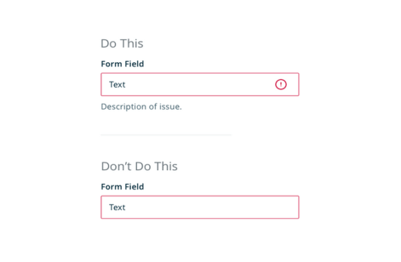
Example (from Invision)
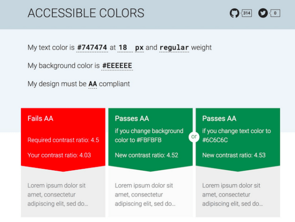
- Be mindful of color contrast. The Web Content Accessibility Guidelines recommend that text and images of text should be presented with a contrast ratio of at least 4.5:1. You can use tools such as accessible-colors.com to check if your colors and text sizing pass for each level of accessibility compliance.
Content
- Present your content in a consistent, linear format that makes it easy for users’ eyes or screen readers to scan the page.
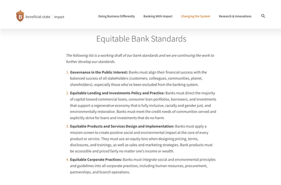
- Make sure that all error messages on the site are designed.
- Include captions, alt text and transcripts for that provide a clear description of the images, video and audio on the page.
- Add descriptive page titles so site visitors quickly understand the purpose of each page.
Motion
- Avoid moving content that flashes more than three times per second, as it can trigger seizures.
- Ensure that any content on the page that automatically plays can be controlled.
Navigation
- Design your navigation to visually indicate where the user is within the website. This could include underlines in the main navigation, breadcrumbs or sub-navigation.
Find more tips and resources on the Website Accessibility Initiative’s website. This article on Accessibility for UX Designers is also a helpful tool.
Ready to prioritize accessibility?
Our team is here to support you with accessibility audits and remediation suggestions. Get in touch to chat about next steps.
If you’re considering a site refresh or rebuild, also check out our Website Rebuild Checklist. This internal questionnaire will help your organization decide if the time is right.
A Certified B Corp, Mangrove is a woman-owned website design and development company with a diverse, talented team distributed around the globe. We’ve been building websites since 2009 that amplify the work of change-making organizations and increase the competitive power of businesses owned by historically marginalized people.
If you found this post helpful, subscribe to our monthly newsletter for notice of future posts and other news from us.


