Accessibility Considerations Matter When Creating Website Content
What to consider when writing for accessibility.

An estimated 48.9 million people are living with a disability in the US alone. This number approaches 1 billion when you consider the world’s entire population. That’s why website accessibility is a topic that can’t—and shouldn’t be—ignored. We believe that everyone should have equal access to the web, and we’re actively taking steps to make our own site, and the sites we create, more accessible. We hope this article helps others move in the same direction. In this blog, the second in a 4-part series, we will focus on what you can control when working with content. If you haven’t read our first accessibility post, start there to get up to speed on the basics, including the various angles from which accessibility should be addressed. You can also check out these related resources:
First things first
The Web Content Accessibility Guidelines (WCAG) set the international standard for accessible content, design, and development. Use their parameters to create a checklist of updates you’d like to make to your site.
Let’s talk content
If you want to start to make your site more accessible without a ton of heavy lifting, content is a great place to begin. Many of the key considerations can be addressed relatively easily without development support. Here are a few tips to help you get started:
- Use clear, straightforward language that’s easy to read and understand. Avoid complex explanations, and aim to keep text-based content at a high school reading level.
- When possible, offer content in multiple formats to accommodate users with different disabilities. This includes text, audio files, and videos. For example, if you embed a podcast audio file, include a transcript.
- Implement video captions and offer downloadable transcripts to aid users who are hearing impaired or unable to play your videos with sound. In addition to helping users with hearing impairments, this provides a better experience for users who are in loud areas or prefer to have their devices on mute.

- Keep text to a minimum and break it up into short paragraphs with visuals. Too much written content on one page can be overwhelming.

- Give users enough time to consume the content on your site. Make sure that rotating banners don’t move too quickly, and give users the ability to stop the movement or go back.
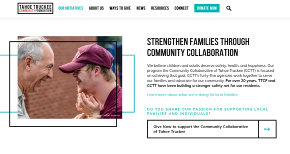
- Ensure that your button text is clear and descriptive, so users can easily take action. Generic button text such as “read more” can denote a variety of actions or pages that a button might lead you. For those who are visually impaired and using screen readers, landing on buttons with vague text can be disorienting. Get additional details about why “learn more” isn’t ideal.

For more tips and helpful information about accessible content, check out these resources on the Web Accessibility Initiative’s website.
We’re here to help
If you want to tackle website accessibility, but are in need of support, get in touch. Our team offers accessibility audits with remediation suggestions to help you take the first steps.
A Certified B Corp, Mangrove is a woman-owned website design and development company with a diverse, talented team distributed around the globe. We’ve been building websites since 2009 that amplify the work of change-making organizations and increase the competitive power of businesses owned by historically marginalized people.
If you found this post helpful, subscribe to our monthly newsletter for notice of future posts and other news from us.


