Mikva Challenge
Preparing youth to be informed citizens and leaders through civic action
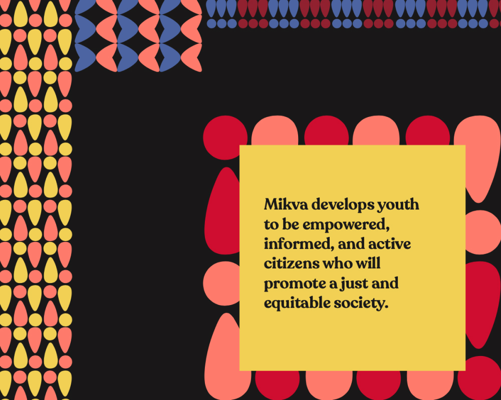
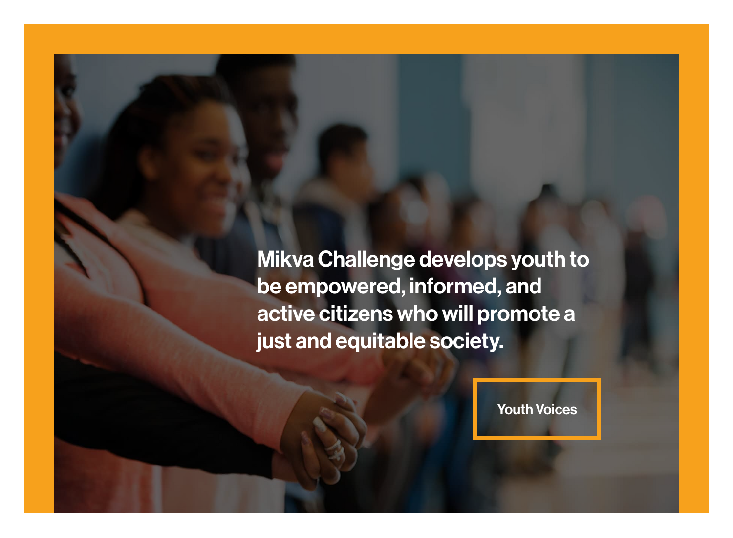
An updated brand identity that reflects a grassroots history of youth engagement positioned this nonprofit to connect with its expanding audiences. Through its hands-on project-based learning programs, Mikva Challenge envisions a stronger, inclusive democracy that values youth voices. The organization impacts over 100,000 youth throughout the United States each year.
The Ask
Mikva Challenge had recently developed new partnerships throughout the county and added two satellite offices in Washington, D.C. and Los Angeles. This growth sparked the need to update the Mikva brand identity to better connect with its core audiences.
Mikva turned to Manoverboard (now part of Mangrove) for rebranding that would suit all of its public-facing platforms, including website, stationery, print materials, and organizational promotional items (buttons, T-shirts).
The Solution
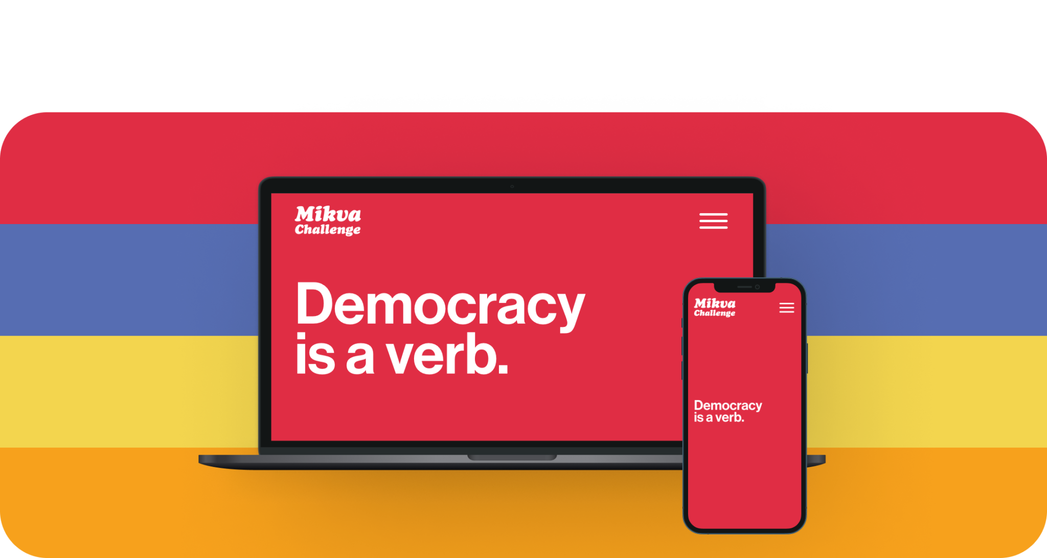
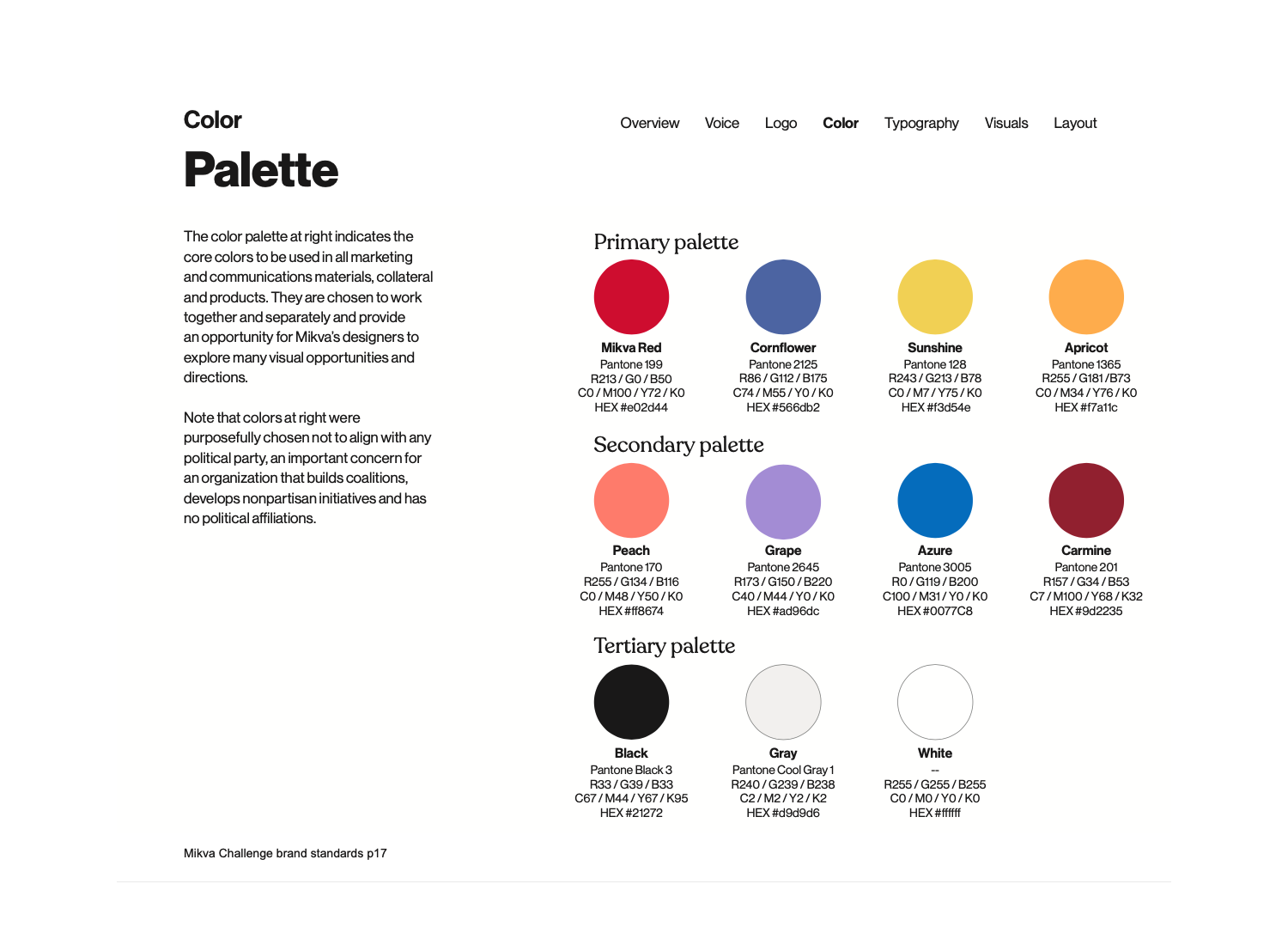
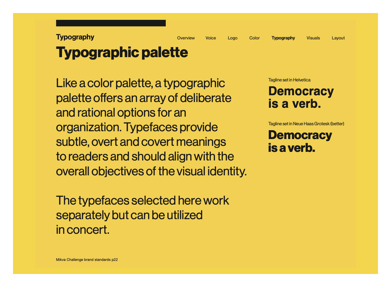
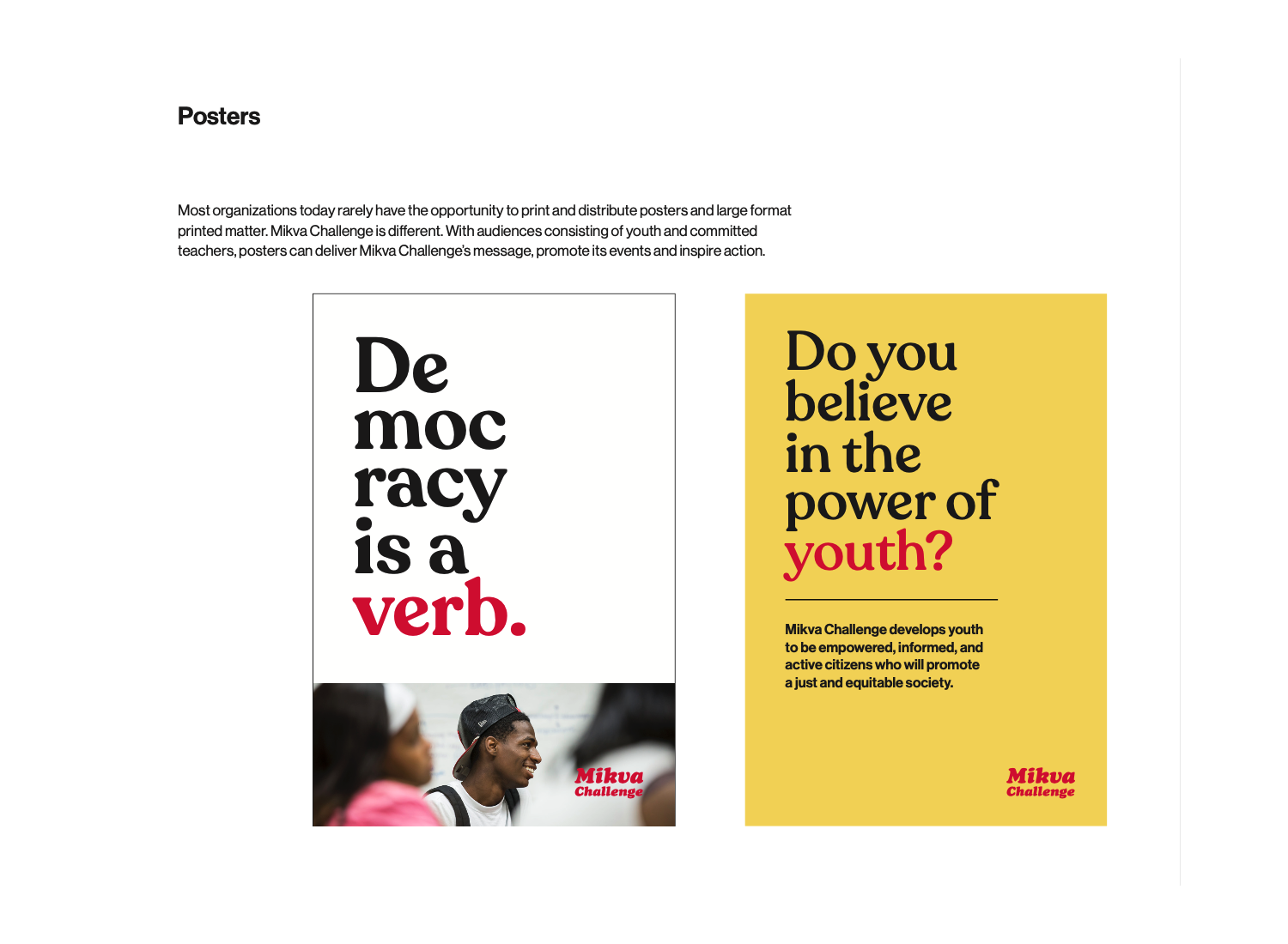
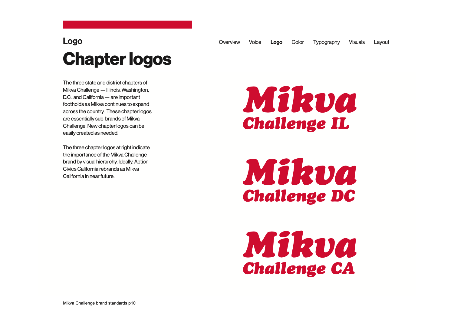
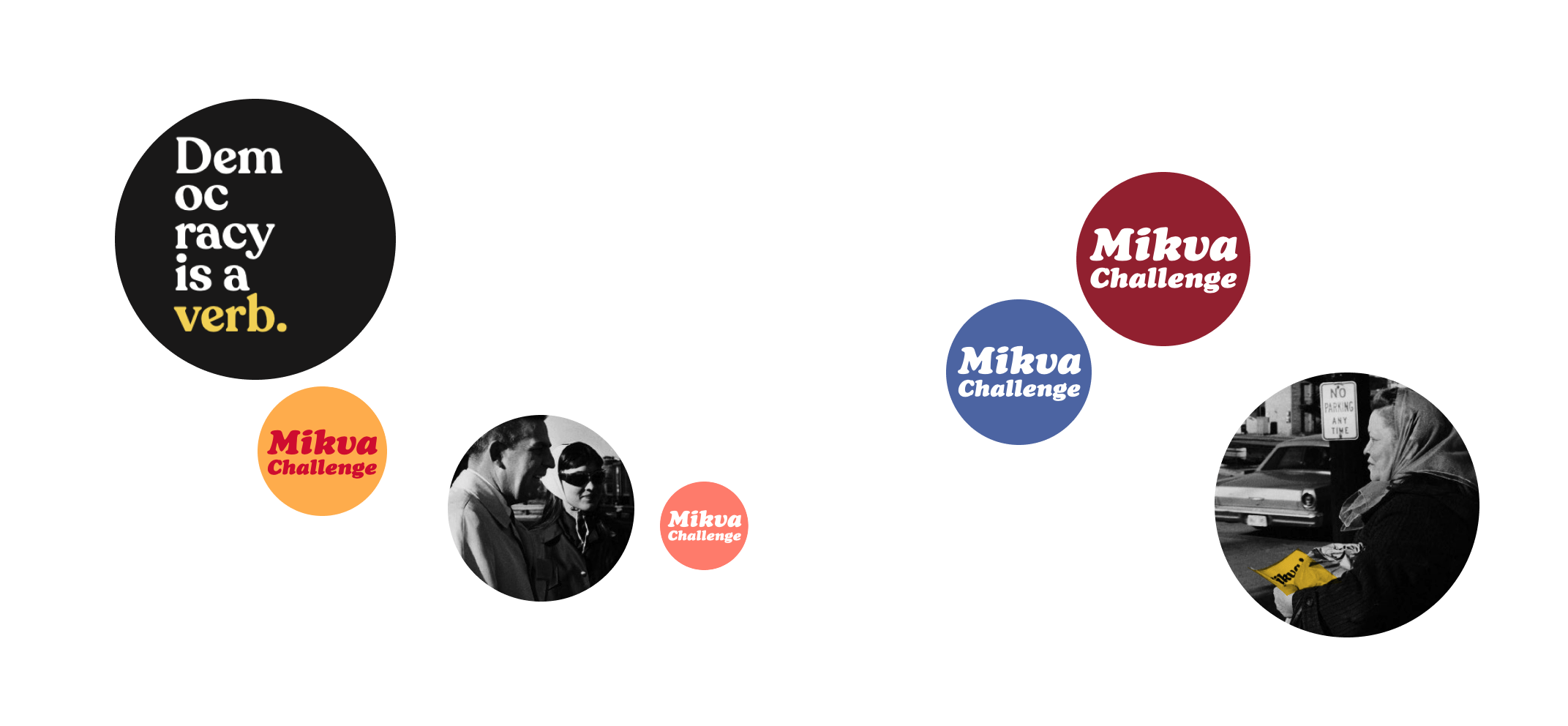
We chose to use a wordmark for the new brand identity to reflect Mikva’s action-oriented character and its focus on conversation and immediacy. Set in Cooper Black italic, the wordmark projects an authentic, stylish retro vibe that stands out in the context of campaign buttons and other promotional materials. For written communication, we chose the Neue Haas Grotesk typeface, using Cooper Black italic for headings and call-outs needing extra punch. A bold new color palette underscores the organization’s impactful messaging.
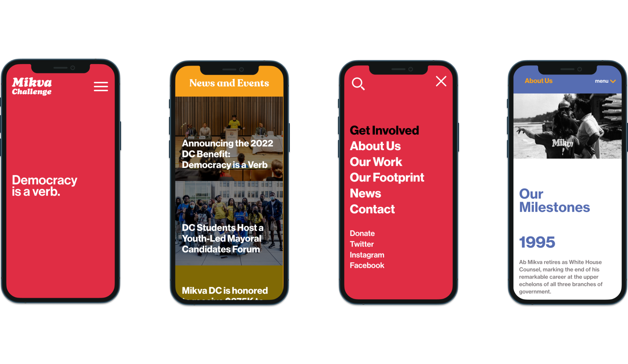
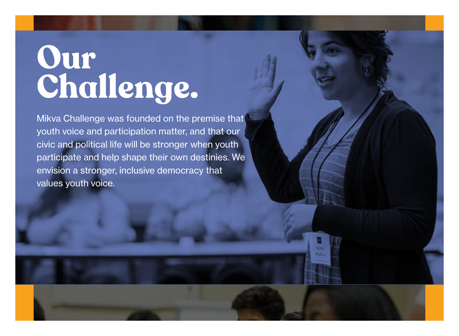
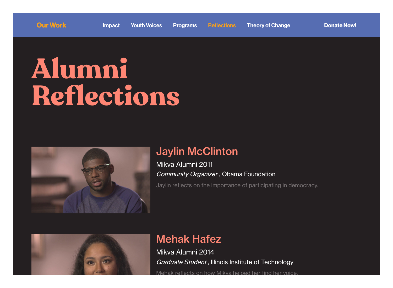
In redesigning the Mikva website, we worked alongside the organization to reduce and reorganize its content for easier navigation and efficiency. We extended the brand’s sense of urgency with the prominent, animated tagline on the homepage: Democracy is a verb followed by a blinking cursor signalling the importance of taking action now. The result is a powerful, cohesive rebranding to inspire the next generation of democracy champions.
Highlights
Poring over Mikva’s campaign materials spanning its decades-long history, we came across sporadic use of the Cooper Black typeface. It was designed in 1922 by Oswald Bruce Cooper, and its black weight was an innovator in advertising typography.
Fittingly, Cooper created the typeface while working in Chicago, Mikva’s home base. Our design team was unanimous in adopting Cooper Black for Mikva’s wordmark, agreeing it embodied the grassroots, boots-on-the-ground spirit necessary for meaningful social change.
Roots:
- WordPress
Our Role:
- Responsive Front-End Development
- Custom Wordpress Development
- Graphic Design
- Identity / Branding
- Strategic Direction


Thinking about a project?
Start a project. Ask for advice. Say hello.
Mangrove respects the GDPR and will never share your information without consent. Read our privacy policy for more on how we handle your personal information.