Mangrove’s Latest Chapter
The how and why behind our brand’s evolution
At Mangrove, our brand story is evolving. For 15 years, we’ve grown, innovated, and consistently aimed to be a force for good in business. We’ve lived and breathed design and code and put our skills to use helping purpose-driven organizations build tools to tell their own stories.
And now, with our growth and evolution, we have created an opportunity to update our brand—from our mission and vision to our visual identity.
These new updates reflect our commitment to accessibility and inclusive design, and to helping changemaking organizations do their best work. It’s more than a facelift. It’s a way to better articulate our foundational values and our vision for the future. We’re excited to share it with you.
Brand equals purpose
Many people think of a brand as a promise. When they purchase a product or service from a brand they know, there is an unspoken agreement that they will get the value, quality, and experience they have come to expect. This way of thinking isn’t wrong, but we prefer to think of branding as an act of purpose, which takes into consideration impact, practicality and accountability.
Consider Patagonia: Their brand isn’t just a promise of delivering quality clothing; it can also convey a deeper purpose—to foster innovation, empower activists, and create positive environmental impact. When we think of branding this way, it becomes even more fundamental because it means an organization’s entire purpose can and should be reflected in its brand.
When our team works with businesses on branding, we first uncover what their organization stands for, what they want to achieve, and how their greater goals will meet audience expectations. Brands built to convey purpose often connect more deeply with customers and team members alike.
What’s behind our brand’s evolution
Over the last few years, Mangrove has experienced several changes. One of the most significant was joining forces with my former studio, Manoverboard, another purpose-driven creative studio and B Corp based in Manitoba. This change brought new skills to our team, deepened our creative expertise, and expanded the experiences we can deliver.
Knowing this, we dove into strategic planning last summer and emerged with a better understanding of how we want Mangrove, as a business, to evolve. While our core purpose remains consistent, it has experienced a few shifts.
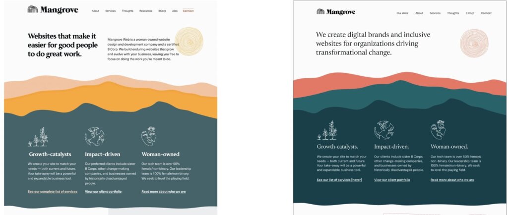
Two aspects of our work that have become focal points for growth are around our direction and our capabilities in the areas of digital accessibility and branding and identity. The updates to our visual brand align especially with those two areas—the new brand demonstrates our commitments to creating accessible, unique and typographically rich identities.
Introducing the new elements of Mangrove
Clients, partners, and anyone following our content may have spotted some changes already. The new elements will continue to roll out and be woven into our work. Here we articulate a few of those updated and refined elements:
Vision
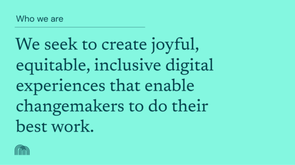
We seek to create joyful, equitable, inclusive digital experiences that enable changemakers to do their best work.
Mission
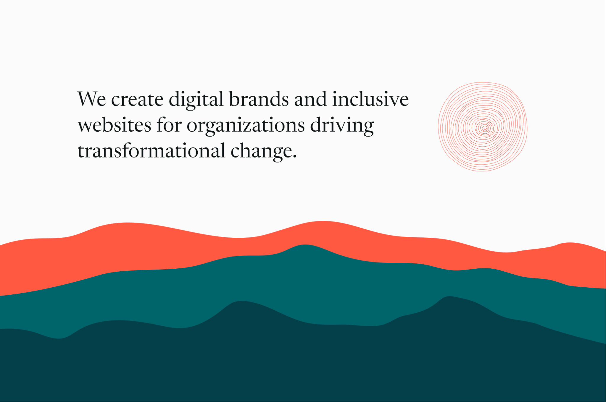
Our mission is to create transformational websites and brands for changemaking organizations.
Color
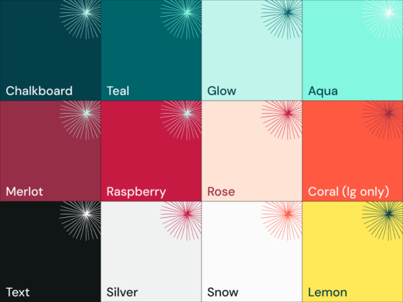
Mangrove is a digital-first firm and our updated color palettes speak to that. We have essentially transitioned from a CMYK palette to an RGB palette, which tends to work better for digital creations. The new palettes are bolder, brighter, and more reflective of a modern, dynamic digital landscape.
Typography
When choosing updated typefaces and their weights, we took accessibility principles into account. After extensive discovery and research, we landed on DM Sans as our primary typeface, complemented by a new serif typeface, Newsreader—which we’ll be using for more content-rich pieces.
Illustrations
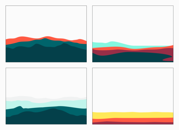
Illustration plays an important role in the Mangrove visual identity. It’s both functional and expressive, and helps bring the whole system to life.
Our landscape illustrations reflect the diverse terrain where Mangrove trees reside and the geographic diversity of places from which our team members connect. Our primary landscape feature remains a mountainscape, but it is now complemented by beachscape, icescape, and prairiescape options.
Internal documents and templates
In addition to our outward-facing identity, we refined all of our internal documents. This was a deliberate, practical and powerful exercise to align our external brand with our internal one. As we continue to refine our current processes, we also ensure a consistent experience for our clients, partners, and team.
Brand standards guide
We’ve also updated our brand standards to ensure consistency across all digital platforms. These guidelines help us use our brand in a cohesive, consistent and recognizable way. Brand standards are an important way to clarify the use of visual elements and to signify that all content and design moving forward aligns with an overall vision.
Why it matters
The process behind our brand updates was also a productive team building exercise, as we gathered insights and ideas from many folks within the organization. The resulting changes reflect a refreshed creative capacity. Our updated identity highlights the global nature of our team—from regions of the U.S. and Canada to Turkey and Spain—and the purpose we aim to serve. We want our clients to feel comfortable and confident when they reach out, knowing they can always expect consistent quality and excellent support at Mangrove. Our goal remains to advance their work through websites and brands that embody their purpose and help them achieve their mission and mandate.
If you’d like to hear more about our rebranding process, please reach out.
A Certified B Corp, Mangrove is a woman-owned website design and development company with a diverse, talented team distributed around the globe. We’ve been building websites since 2009 that amplify the work of change-making organizations and increase the competitive power of businesses owned by historically marginalized people.
If you found this post helpful, subscribe to our monthly newsletter for notice of future posts and other news from us.


