3 Ways to Add Financial Data to Your Nonprofit’s Website
Build donor trust, increase support, and help tell your story with this key information

What motivates a donor to give to an organization? While alignment with personal values and causes is important, trust is also a key factor. So, how can nonprofits build that trust? Recent surveys reveal that nearly 70% of donors consider trust essential before giving, yet only 20% say they highly trust charities. When asked what best signals a nonprofit’s trustworthiness, most donors pointed to the accomplishments shared by the organization.
By nature of being a 501(c)(3) organization, nonprofits can evaluate their accomplishments by looking at financial data. For instance, an environmental nonprofit may have raised enough funds to build wells, install water purification systems, and provide clean drinking water for thousands of people. Or, a religious organization may have used donations raised to purchase food and provide shelter to homeless individuals in the community.
Telling the story of your nonprofit’s financial journey, from receiving a donation to putting it to use, can bolster trust not just among donors, but with stakeholders and the general public as well. With your website being the central hub for your communications efforts, it’s the perfect place to house this information. Let’s look at three ways you can add financial data to your nonprofit’s website to help establish credibility and inspire support:
1. Create a financials page
User experience should be top of mind when designing your nonprofit’s website. Make it easy for site visitors to find what they’re looking for—primarily, information about your mission, work, and how they can get involved.
To make your financial data stand out, create a dedicated “Financials” page that highlights the information you want to share. This could include:
- Key statistics and infographics that illustrate your financial performance
- Your most recent annual report, as well as reports from previous years
- A quick written summary of your nonprofit’s accomplishments
- Any other data you are able to share
For example, we worked with Wikimedia Foundation on its 2016-17 annual report, structuring the financials page in a deliberate and vibrant way.
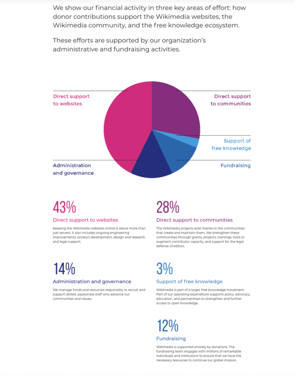
Upon landing on the page, visitors are presented with the most compelling statistics in bold graphics. The graphics highlight key areas of effort, which include: the Wikimedia websites, the Wikimedia community, and the free knowledge ecosystem. Below that, visitors can review the Wikimedia Foundation’s balance sheet for 2016-17 as well as their statement of activities.
This structure puts the most important financial insights at the top of the page while also providing access to the organization’s key accounting details. All of this contributes to making Wikimedia one of the most transparent nonprofit organizations.
Beyond simply presenting information, a page dedicated to financials can also inspire visitors to take action. Before you start optimizing your donation form or sharing ways to give, consider how your financials page can spur donations. For example, after noting that 500 donors made it possible for your organization to impact thousands of beneficiaries, ask site visitors if they want to join the community of supporters and make an even bigger difference.
2. Use infographics, charts, and other data visualizations
As demonstrated in the example of Wikimedia Foundation’s annual report, data visualizations can be a powerful way to share financial highlights. However, these illustrations aren’t restricted to your financials page.
Consider adding infographics, charts, and other visualizations to pages throughout your nonprofit’s website, including its homepage, About page, and donation page. Convert your financial data into visually appealing images to present the highlights of your financial activity in an engaging way. This could include:
- Bookkeeping data: According to Foundation Group, bookkeeping data includes donations, expenses, and any other transactions your nonprofit makes. Illustrate these data points in charts to make the numbers more engaging. For example, use a bar chart to compare the amount received in one-time gifts versus monthly or quarterly donations.
- Budget comparisons: Compare your nonprofit’s projected and actual budget figures in side-by-side charts. Use the surrounding text to briefly explain any differences in the figures or adjustments you’ve made to your strategy.
- Insights from financial statements: Highlight key figures from your statement of activities, statement of financial position, and statement of cash flow. This helps donors grasp your nonprofit’s financial health and demonstrates your ability to responsibly allocate resources.
When adding visualizations to your website, be sure to prioritize accessibility. Add alt text to describe each image for users who leverage screen readers when navigating your website. While your brand colors might help the visualizations blend seamlessly into your web design, use colors with enough contrast so that the image can be easily understood. For more tips on making images accessible, follow the guidelines from the Web Accessibility Initiative (WAI).
3. Draw attention to your annual report
An annual report compiles all of your nonprofit’s activities, projects, and initiatives for a given year. This makes it a valuable tool for giving stakeholders a comprehensive view of your organization’s funding and how you used it.
As such, your annual report should be easy to access so that no matter which page visitors land on, they know how to learn more about your nonprofit’s activities. Prominently display buttons that link to your most recent annual report on your:
- Homepage: Create a section on your website’s homepage that specifically calls out your most recent annual report and what donors can learn by viewing it. Make it easy and compelling for visitors to learn more by exploring your report. Research nonprofit web design best practices to ensure your call to action aligns with the visual style of your homepage.
- Donation confirmation page: Financial data can greatly resonate with donors who have given their own money to your organization. After someone submits a donation through your website, provide a link to your annual report to show how you’ve used donations in the past to give them an idea of how their gift will make a difference.
- Data visualizations: Wherever financial data from your annual report appears on your website, include a button that links to the full report. This contextualizes the data for interested donors and also encourages them to engage with the information by learning more.
Remember to contextualize these calls to action by connecting financial data to your nonprofit’s mission. For example, what did your organization’s founders set out to do when they started your nonprofit, and how does the financial data presented show that you’re fulfilling that purpose?
Data sharing is essential to communicating with donors, stakeholders, grantmakers, corporate partners, and every other audience—but financial data is particularly useful when added to your website.
To ensure this data resonates with your target audience, consider using CRM data to guide your website design. This helps you better understand your audience so you can create content and share financial insights that resonate with them. As a result, you can be confident that your financial data isn’t just presented to your audience, but retained in their memories. For more web design inspiration, browse other past branding and web design projects.
This article includes tips from a consulting company that advises nonprofits.
A Certified B Corp, Mangrove is a woman-owned website design and development company with a diverse, talented team distributed around the globe. We’ve been building websites since 2009 that amplify the work of change-making organizations and increase the competitive power of businesses owned by historically marginalized people.
If you found this post helpful, subscribe to our monthly newsletter for notice of future posts and other news from us.