AI, Search, and Nonprofit Websites: What You Need to Know Now
Practical tips and actions for navigating AI’s effects on web searches
February 24, 2026
Many nonprofits are noticing changes in how people find and interact with their websites. Search results look different, web traffic patterns are shifting, and AI is increasingly shaping how people research information online. This article explores what’s changing, why traffic may look different, and where nonprofits can focus their attention with confidence.

Websites That Power Philanthropy
How we support foundations and nonprofits online
September 8, 2025
We help foundations thrive online with accessible websites, CRM integrations, and donation tools that strengthen impact and donor trust. In this article, we look at why strong communications matter to philanthropy and share examples of foundation websites we’ve designed to make complex work more visible, accessible, and actionable.

Why Building a Thoughtful Website Takes Time
Behind the scenes of a meaningful site build, from kickoff to launch
June 23, 2025
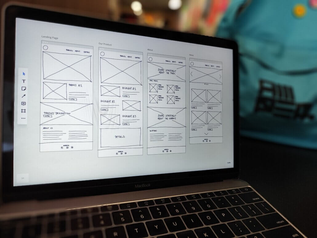
Building a strategic, functional, accessible, and beautiful website takes time. At Mangrove, we work with organizations who care deeply about their missions and communities, taking the time needed to build sites that serve audiences, meet accessibility standards, and stand the test of time. In this article, we break down key factors that influence how long a site can take to build.

Start Strong, Before You Launch
Use the lead-up to your new site to deepen community connection and share your story
June 23, 2025
Once your website project is underway, it’s natural to start thinking about launch day. But the time between kickoff and go-live offers meaningful opportunities to connect with your community, build momentum, and share the “why” behind your new site. In this article, we explore how the pre-launch phase can become one of the most strategic parts of a multi-month website journey.

How to Create an Annual Report That People Actually Want to Read
Beyond financials—engage, inspire, and make an impact with strategic storytelling and design.
February 26, 2025
An annual report is about more than just sharing financials—it’s a strategic opportunity to tell your brand’s story. With compelling design, strong storytelling, and impactful visuals, you can create a report that informs, inspires, and leaves a lasting impression.

Want a Website That Truly Connects? It All Starts With Content Strategy
Explore our approach to building content strategies that engage visitors and drive action
January 30, 2025
A key element of any high-performing website is a well-crafted content strategy. A thoughtful strategy helps guide visitors through your site, build trust, and inspire action. We share the key steps we take to create content strategies that support organizational goals and help websites drive results.

3 Ways to Add Financial Data to Your Nonprofit’s Website
Build donor trust, increase support, and help tell your story with this key information
August 26, 2024
What motivates a donor to give to an organization? While alignment with personal values and causes is important, trust is a key factor. So, how can nonprofits build that trust? We explore three ways your nonprofit can add financial data to its website to establish credibility and inspire support.

Good Web Design is Aesthetically Pleasing, Great Web Design Incorporates Accessibility
How prioritizing accessible web design improves user experience and site functionality
August 2, 2024
Modern websites are sleek, visually appealing, and regularly updated to stay current with design trends. As digital and social landscapes continue to evolve, we have a responsibility to acknowledge the different needs of people who use technology. Here, we explore practical ways to prioritize accessibility and why it’s essential for creating inclusive websites.

Tapping into the POUR Principles
How accessibility fundamentals can expand your audience
June 28, 2024
Your website may be visually striking and filled with valuable content, but is it inclusive and accessible to everyone who might visit it? Digital accessibility is essential, and many sites still have room to improve. By organizing accessibility requirements around the principles of POUR, it becomes easier to see where changes are needed. We explore what each principle represents and how they can help expand your audience.

Mangrove’s Latest Chapter
The how and why behind our brand’s evolution
June 24, 2024
At Mangrove, our brand story is evolving. For 15 years, we’ve grown, innovated, and consistently aimed to be a force for good in business. We’ve lived and breathed design and code and put our skills to use helping purpose-driven organizations build tools to tell their own stories. And now, with our growth and evolution, we have created an opportunity to update our brand—from our mission and vision to our visual identity. We’re excited to share it with you.

5 Strategies for Optimizing your Donation Form
Practical tips to increase accessibility and enhance giving opportunities
June 17, 2024
It’s no secret that a cornerstone page on many nonprofit websites is the donation form. In many cases, donation forms are the primary channel for potential donors, making them a significant giving resource. Ensuring your form is optimized and accessible is one action that could enhance your fundraising efforts. Here, we explore five ways to optimize your donation form to increase giving potential and make it usable by as many visitors as possible.

How Mangrove Serves Startups
Dive into our work with 5 visionary organizations
April 8, 2024
Helmed by trendsetters, innovators and industry changemakers, startups bring something fresh to the marketplace—a product or service that can empower groups of people, fill vital gaps, or move industries in a different direction. Authentic branding and efficient websites are critical for their success. We dive into our collaborative work with 5 visionary startups.

How to Use CRM Data to Inform Nonprofit Website Design
Tips to help your organization design a website tailored to your audience
March 26, 2024
Many nonprofits fret about the best way to approach website design without realizing they have an incredible source of information and guidance available—their constituent relationship management systems (CRMs). Here’s a look at some of the ways you can use this information to make more informed web design decisions that appeal to your audience and drive engagement.

Making the Business Case for Website Redesign in 2024
Key steps to secure support for revamping your digital presence
December 29, 2023
Updating your website every 2-3 years can help keep it current, on trend, and maintain a positive user experience. Here’s a look at the key steps you can take to build a convincing case for this important and strategic undertaking.

Website Accessibility and the Law
An overview of North American web accessibility legislation
September 7, 2023
It’s critical to ensure that everyone can use your website; first and foremost, it’s the ethical thing to do. Second, it’s good for business, and finally, it could keep you out of legal trouble. In the fifth and final article in our accessibility series we provide an overview of accessibility legal considerations in the U.S. and Canada.

How To Get and Give Effective Design Feedback
Practical tactics for a successful collaboration between clients and design agencies
July 31, 2023
The most successful design projects happen with clear communication and collaboration between the design team and the client. At Mangrove, our clients play an integral role in how successful a project is by providing guiding information during discovery sessions and helpful feedback all along the way. The processes we use help us to clearly understand our client’s goals and vision. We know these can be unfamiliar, for new clients especially, so we put together a helpful set of practical tactics and insights on how to get and give effective feedback.

Creating a Meaningful Impact Report
Tactics to make your next report easier and more engaging
March 16, 2023
At Mangrove, we’ve published an annual impact report since we became B Corp certified in 2016 and have helped many other organizations do the same. Over the years, we’ve discovered tools and tactics that make the process easier and result in a report that stakeholders are more likely to read. We’re sharing our insights here and hope they’ll make your next annual or impact report shine brighter with less effort.

Our Website and Visual Brand Gets an Upgrade
Introducing our new logo and website
July 20, 2021
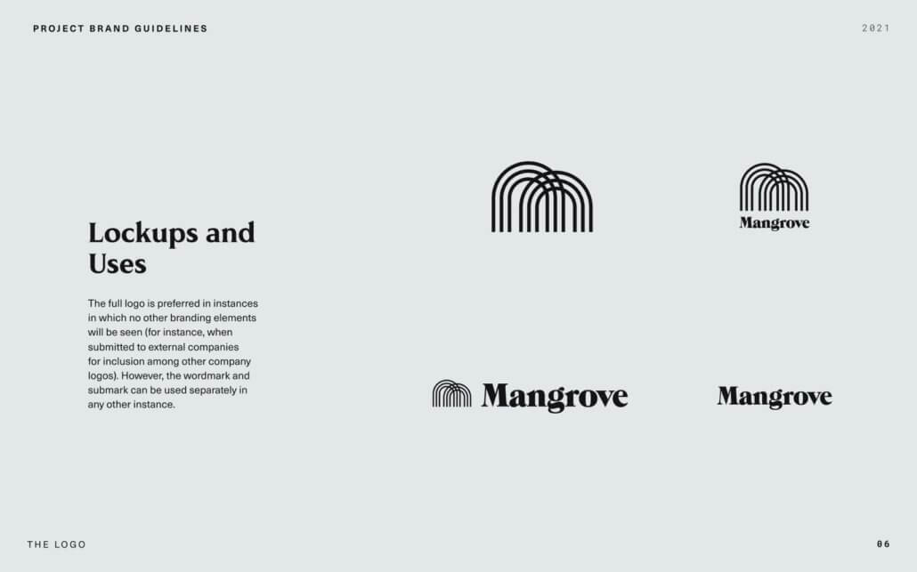
If you haven’t yet noticed, Mangrove has an all-new look and website! Learn about our process, collaborators, and the experience of rebuilding your own brand and site.


